THE CHALLENGE
Select a print ad from before 1980 that you admire, then redesign it in a contemporary style as a full-page color ad for one of the following magazines: Wired; GQ; Better Homes and Gardens; O, The Oprah Magazine; Dwell; Vanity Fair; or US Weekly. Feel free to reinterpret the photography, illustration, copy and typography as necessary to match today's design idiom.
Time Limit: 90 minutes
MY TOOLS:
Pen and paper
Flickr, and Google Images
Adobe Photoshop
Adobe InDesign
IDEA GENERATION: 10 MINUTES
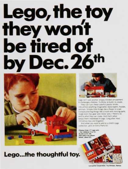
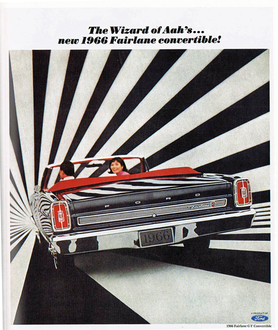
I spent the first 10 minutes searching for ads from the 1960's that interested me. Since I had limited time to find one, I wanted to focus on a specific decade, and since I love 1960's music, it seemed like as good a choice as any! Two specific ads caught my eye: Lego and Ford. I liked the Lego ad because it advertises a problem still true today: kids get tired of toys quickly after they've played with it once. And the Ford ad caught my attention because it was so clearly marketing to the specific time period, with it's wild background.
MY TOOLS:
Pen and paper
Flickr, and Google Images
Adobe Photoshop
Adobe InDesign
IDEA GENERATION: 10 MINUTES
I spent the first 10 minutes searching for ads from the 1960's that interested me. Since I had limited time to find one, I wanted to focus on a specific decade, and since I love 1960's music, it seemed like as good a choice as any! Two specific ads caught my eye: Lego and Ford. I liked the Lego ad because it advertises a problem still true today: kids get tired of toys quickly after they've played with it once. And the Ford ad caught my attention because it was so clearly marketing to the specific time period, with it's wild background.
| 
|
SKETCHING IDEAS: 20 MINUTES
At this point, I still hadn't decided which ad I would revitalize, so I made a list of the characteristics that each new ad would highlight. For instance, Lego is focusing on the female audience and current car advertisements only highlight the cars, not the people inside. I also drew a mockup of each ad to identify which might be best to replicate in the limited time.
At this point, I still hadn't decided which ad I would revitalize, so I made a list of the characteristics that each new ad would highlight. For instance, Lego is focusing on the female audience and current car advertisements only highlight the cars, not the people inside. I also drew a mockup of each ad to identify which might be best to replicate in the limited time.
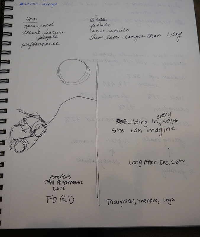
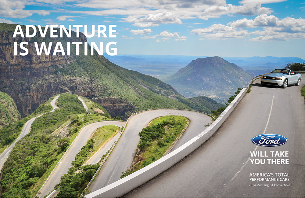
I elected to continue with the Ford ad because I thought the new ad could potentially look so different than the original. Current car advertisements often feature the performance of the vehicle and not the people who are riding in it. They also put the car in context and include a very desirable location to make the reader feel like he wants that kind of life, and that having that car will get him there.
I selected GQ as the magazine of choice that my advertisement would run in.
I selected GQ as the magazine of choice that my advertisement would run in.

I researched the demographic of GQ Magazine to understand who the reader would be. He is mostly a male reader, average age of 34, high average income at $74,000 and typically single. Understanding the reader helped me to select imagery for the piece. A single guy doesn't want to see pictures of families riding around in a Mustang. But he would be excited by adventure and opportunities to drive fast in a fun environment.
VISUAL DESIGN: 60 MINUTES
Based on my earlier sketch, I had a specific design that I needed to find images for. The sketch included a landscape with mountains and roads and a Ford Mustang that sits on that road.
I chose this design for specific reasons:
Based on my earlier sketch, I had a specific design that I needed to find images for. The sketch included a landscape with mountains and roads and a Ford Mustang that sits on that road.
I chose this design for specific reasons:
- The original ad says that Ford has America's Total Performance Cars, and the ad will highlight this.
- A good location to highlight performance might be a mountainous terrain with a lot of curves and difficult driving.
- A young single male is likely interested in an adventurous lifestyle. Even if he doesn't go to locations like this, he may still imagine himself living this way.

It was difficult to highlight the terrain and the feeling of adventure while also making the car the star of the ad. The pictures I chose to use to create the ad made this more difficult, and possibly didn't show off the car enough, because it was small and off to the side.
I found the photos on Flickr and Google Images. I chose the background photo first, and that choice influenced the type of car photo that I needed to find. The car needed to face the right direction and be from the right angle to feel natural against the background.
I developed a slogan "Adventure is waiting...Ford will take you there" to accompany the photos. I had written several different potential slogans but used this one because it signified that buying a Ford leads to adventure, which is what a young male would be interested in.
ELEMENTS FROM THE OLD TO THE NEW AD
I updated the car from the original Fairlane GT to the Mustang GT because the Fairlane is no longer in production. To still bring in elements from the old ad though, I included the slogan "America's Total Performance Cars". I also elected to create a full spread ad to take advantage of the full landscape of the photo. For that reason, the text is positioned on opposite sides of the spread to reduce the risk of text appearing in the margin.
OVERALL
I enjoyed the process and working with existing photographs in Photoshop and InDesign was very comfortable for me. I feel like the ad does get across the message I want to deliver and really addresses the correct audience. I have concerns that the car isn't large enough on the ad, however I think that placing text on the bottom right corner does attract the eye towards the car.
If I had more time, I would research Ford's design language to find their preferred font. I did some preliminary research where I found that their font is typically Sans Serif, so I chose to use Open Sans. It would also be really interesting to put the old model of the Fairline in the new ad, to compare how both ads convey the message about the same vehicle.

I love the juxtaposition of the "Adventure" text opposite from the car. In a way, I think because that text is above the road, it tells a story that the adventure is waiting where the car is heading.
It is telling a story with combined imagery and words.

If I had it to do over again, the first thing I would do in InDesign is set up a grid. I was focusing so much on finding the right photos for a good portion of the 60 minutes that I didn't spend enough time setting up the layout for the text. The paragraph spacing on the bottom right text is quite wonky and needs consistency.
SOURCES
Background Image: Flickr user Jbdodane; https://www.flickr.com/photos/jbdodane/13726220075
Car: Google images; http://www.automotiveaddicts.com/wp-content/uploads/2009/10/2010FordMustangGTConvertibleGTHeadonActionRightCurve01small.jpg
Ford Logo: Google Images; http://www.zeroto60times.com/blog/wp-content/uploads/2013/02/ford-cars-logo-emblem.jpg

 RSS Feed