THE CHALLENGE
Create a brochure cover promoting the Slow Food movement. As part of your design, you must use five or more unique fonts.
Time Limit: 30 minutes
PLANNING: 5 MINUTES
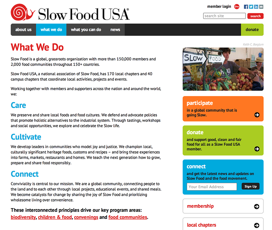
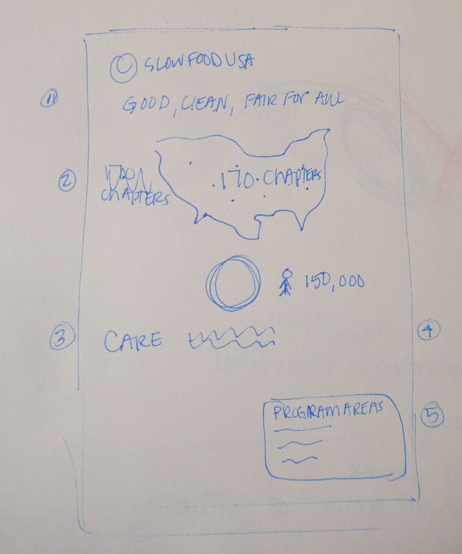
With only a 30 minute challenge, there was not much time for planning. I quickly decided to create a brochure from the text on the Slow Food USA website (http://www.slowfoodusa.org/what-we-do), and sketched a quick version of where I could include multiple fonts.
With only a 30 minute challenge, there was not much time for planning. I quickly decided to create a brochure from the text on the Slow Food USA website (http://www.slowfoodusa.org/what-we-do), and sketched a quick version of where I could include multiple fonts.
| 
|
However, I quickly realized that my brochure would simply have 5 or more fonts because that was the requirement. If I were ever designing a brochure of that size, I would never use 5 different fonts. How could I create a brochure where different font choices would be intentional?
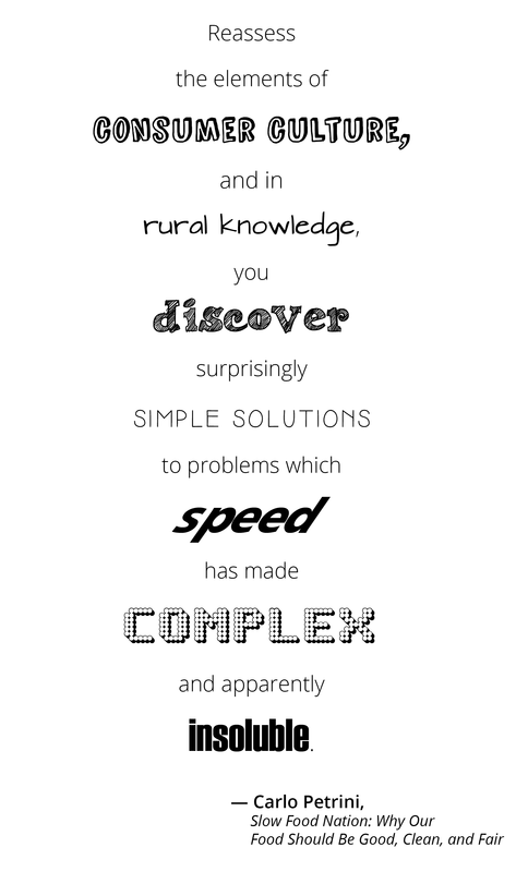
I found a quote by Carlo Petrini from "Slow Food Nation: Why Our Food Should Be Good, Clean, and Fair" and decided to use a portion of that quote as my brochure.
"reassess the elements of consumer culture, and in rural knowledge, you discover surprisingly
simple solutions to problems which speed has made complex and apparently insoluble."
DESIGN: 25 MINUTES
I quickly got to work designing my brochure. I remember many of Shel Silverstein poems that incorporated the illustrations and text in a vertical column in order to tell the story. This was the inspiration for the way I designed my grid. I selected fonts for individual words/phrases that have a special significance to the quote, and the fonts I chose mirror the feelings of the words. For example, I selected a font for "Speed" that looks like it is speeding forward. I left the supporting text in a consistent Open Sans font to not distract from the rest of the words of the quote.
OVERALL
I don't think I'll be designing any single page with 5 or more different fonts again anytime soon (I hope). However, this challenge did get me to think quickly "what is the best way to solve this particular problem". I could have easily inserted 5 fonts into my original plan, but that would have been just inconsistent and following the prompt. Instead, I considered what kind of layout would actually be enhanced by 5 fonts and quickly moved in that new direction.
I don't think I'll be designing any single page with 5 or more different fonts again anytime soon (I hope). However, this challenge did get me to think quickly "what is the best way to solve this particular problem". I could have easily inserted 5 fonts into my original plan, but that would have been just inconsistent and following the prompt. Instead, I considered what kind of layout would actually be enhanced by 5 fonts and quickly moved in that new direction.

If I had more time, I would have loved to add color to the design to help make it more intriguing. However, I would need to be careful with color choices to make sure there isn't a rainbow of words on the page. It could be best if the entire quote is in one color so that there aren't multiple elements of differentiation for each words, with both the color and font choice.
Additionally, I would have liked to play with the size of the supporting text to make it smaller and less prominent compared to the highlighted words. I would also revisit the placement of Carlo Petrini's name at the bottom of the quote to align it with the appropriate part of the grid. At the end of the 30 minutes, I is currently just placed below the text in order to complete the
Additionally, I would have liked to play with the size of the supporting text to make it smaller and less prominent compared to the highlighted words. I would also revisit the placement of Carlo Petrini's name at the bottom of the quote to align it with the appropriate part of the grid. At the end of the 30 minutes, I is currently just placed below the text in order to complete the

 RSS Feed