THE CHALLENGE
Design the interior spread of an 11" x 17" brochure for a juvenile diabetes treatment plan. Design the name of the treatment plan, and the logo. Design the brochure as follows:
1. Roll a die to determine the number of columns in your grid on the left and right pages. Design your spread with the following:
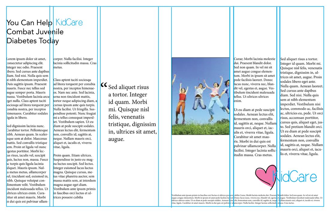
1 picture (3" x 4")
4-6 paragraphs of copy
1 paragraph legal (100 words)
1 inset/pull quote (20 words)
1 headline (8 words)
Logo (at least 1.25" wide)
2. Roll the die again, and add that number of columns to your page grid.
Time Limit: 30 minutes
MY TOOLS:
Pen and paper
Adobe InDesign
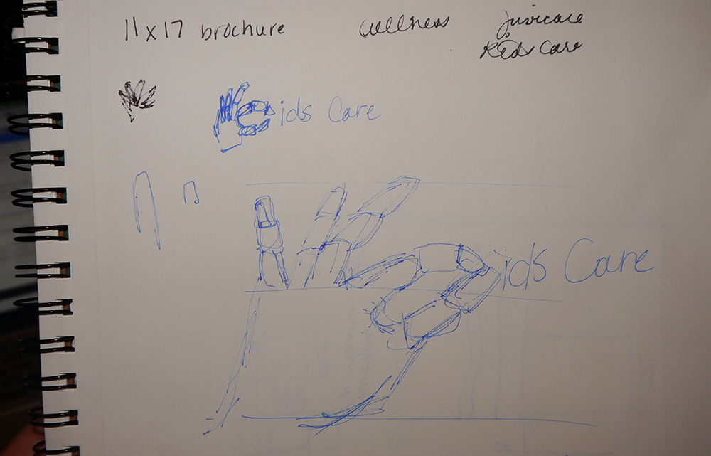
LOGO DESIGN: 5 MINUTES
I designated the first 5 minutes for only deciding on the name of the diabetes organization and sketching out a logo. I sketched a more intricate logo with a child's hand standing in for the "K" in "KidsCare", however when it came time to replicate it in Adobe InDesign, I didn't fully illustrate the logo. Due to my past challenges and getting stuck on the time limit, I wanted to be sure that I spent the rest of the time finishing the challenge, not on the extra stuff.
MY TOOLS:
Pen and paper
Adobe InDesign
LOGO DESIGN: 5 MINUTES
I designated the first 5 minutes for only deciding on the name of the diabetes organization and sketching out a logo. I sketched a more intricate logo with a child's hand standing in for the "K" in "KidsCare", however when it came time to replicate it in Adobe InDesign, I didn't fully illustrate the logo. Due to my past challenges and getting stuck on the time limit, I wanted to be sure that I spent the rest of the time finishing the challenge, not on the extra stuff.
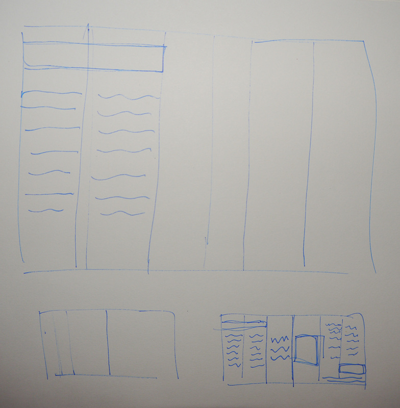
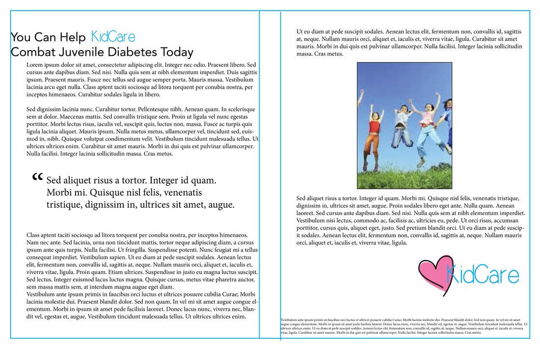
DESIGN 1: 1 COLUMN, 35 MINUTES
I rolled the die and received a "1" for my first design iteration. One column per page seems relatively easy enough, because there is only one place to put things! However, there was a lot more to it.
Before arranging anything in Adobe InDesign, I first sketched a layout on paper to help gauge the proportions.

| 
|

I immediately began to feel the challenge of designing a layout with only one column and so much text. While it all could really only go one place, it felt difficult to put it all in and have a purpose to the location of everything. Any extra white space around the text felt awkward and out of place. I actually increased the size of the body text to take up more space on the page.
DESIGN 2: 3 COLUMN, 20 MINUTES
Next I rolled a 2, and added two more columns to each page. Now that I had all the text imported into the document, it was much faster to rearrange the layout with the extra columns. I experimented with the layout of several different sized columns in order to find the best balance of white space and text. With this iteration, the white space felt more natural in the design, whereas the whitespace in the first iteration just felt like there was something missing.
While putting images in the middle of the text, might have broken it up and added more white space to the layout, it also separated the text and made it difficult to follow.
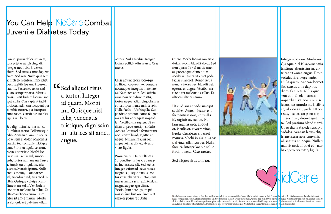
A grid with two small columns, and one large inside column set off the images and quotes so they were easier to scan among the body text.

It would have been interesting to try an iteration with even less text. It's often easy to make a grid of 3 or more columns feel natural when there is content to fill it up. However, the grid becomes most interesting and valuable when the content is sparse and the balance of white space and content is tested.

 RSS Feed