THE CHALLENGE
Project yourself far into the future. Create a seventieth anniversary edition of Helvetica - a modern update of the font composed of destroyed letterforms. How would you associate your work to the legacy of the original face?
Time Limit: 120 Minutes
TOOLS
Pen and Paper
Adobe Photoshop
TOOLS
Pen and Paper
Adobe Photoshop
WHAT IS HELVETICA: 15 MINUTES
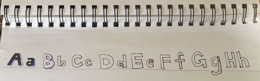
The very first thing I did was sketch the current Helvetica alphabet into my notebook. After all, you can't look toward the future if you don't understand what is going on now.
The very first thing I did was sketch the current Helvetica alphabet into my notebook. After all, you can't look toward the future if you don't understand what is going on now.

I thought about what Helvetica represents and why is so commonly used. It is clean, simple, easy to read, and applicable to so many styles of design.
WHAT IS THE FUTURE: 25 MINUTES
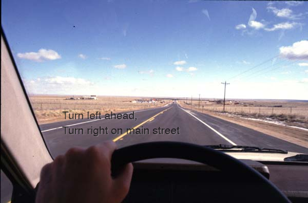
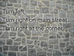
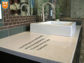
In order to design a Helvetica for the future, I thought about what we will be doing with the font by the time we reach the 70th anniversary in 2027. We won't be viewing type just on our phones and tablets; will be living with our media everywhere. Text will appear on walls and uneven surfaces, on countertops, on car windshields.
In order to design a Helvetica for the future, I thought about what we will be doing with the font by the time we reach the 70th anniversary in 2027. We won't be viewing type just on our phones and tablets; will be living with our media everywhere. Text will appear on walls and uneven surfaces, on countertops, on car windshields.

While the challenge encouraged creating a font from destroyed letterforms, I thought it was more important to design the font based on how it will be used. I spend a lot of time thinking about the future of technology and how the font will need to adapt to new media. Traditional flat panels won't be the only way we view text. There will be uneven surfaces, weird angles, and large scale text.
The font design needs to be readable against ragged surfaces with multicolored backgrounds. It also needs to be legible when at an angle or slanted and scale well. The design shouldn't be too think so it is readable under all conditions and surfaces.
DESIGN: 80 MINUTES
My main design considerations were about the legibility, so I imagined that the font would need a drop shadow or another 3D effect to make it stand out from the background. I went into Photoshop and started experimenting with some different effects with the font on various backgrounds.
My main design considerations were about the legibility, so I imagined that the font would need a drop shadow or another 3D effect to make it stand out from the background. I went into Photoshop and started experimenting with some different effects with the font on various backgrounds.
| 
|
| 
|
I added drop shadows, strokes and other effects to help the font stand out from the uneven surface of the background. I wanted to design something that was readable on non traditional surfaces of the future, because I don't think we'll be reading only on backlit flat surfaces, like we are today.
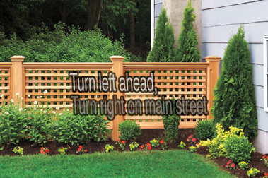
My final font design had a stroke of 3 pixels in a darker color than the font. I experimented with different shades of the interior color, and I found that the lighter interior helped to stand out against the dark stroke and made the letter easier to read.
OVERALL
What was difficult for me during this challenge was the idea of creating a new font by destroying the letterforms of the old font. First, I'm no typographer, and letterform design is a detailed art. Secondly, and most importantly, I didn't think destroying the current letters would help me solve the problem at all. I focused on how the new font would be used in 2027, and designed the font to be best used in that way.
I am always looking to solve the underlying problem that a person experiences, and my approach for this problem helped me get there.
I am always looking to solve the underlying problem that a person experiences, and my approach for this problem helped me get there.

The backgrounds I experimented with all had the font appearing right on top of the surface. It would have been fun to think about how new materials might come into play. Perhaps a patterned wallpaper or countertop could change it's actual design to display the letters, instead of the font just appearing on top. With more time, I would have liked to brainstorm potential new technology solutions for how to display media.

 RSS Feed