THE CHALLENGE
Come up with a name for a new clothing company whose work is inspired by street art, then design a logo for your company in a graffiti style. Then create a motion graphics storyboard where your logo will be painted into place on a TV within the store.
Time Limit: 120 minutes
MY TOOLS:
Paper and pen, pencils, markers
Wacom Tablet
Adobe Illustrator
Adobe Photoshop
Adobe Indesign
MY TOOLS:
Paper and pen, pencils, markers
Wacom Tablet
Adobe Illustrator
Adobe Photoshop
Adobe Indesign
RESEARCH: 15 MINUTES
I cannot say that I was any sort of graffiti aficionado when I started this challenge. My knowledge pretty much stems from my 10 minute morning bus route, so I started with some Google research to find out out the key characteristics of graffiti. I ended up learning a lot more than just the key styles (tag, roller, bombing, wild style, capping - in case you were wondering).
Inscriptions and drawings have been found on ancient ruins in places like Greece and modern day Turkey from as early as the first century BC. My fascination with Pompeii has grown after learning that the Mt. Vesuvius eruption preserved Latin curses, magic spells, declarations of love, and messages of beautiful prostitutes nearby. Modern day graffiti can be political, artistic, or a send a message to rival gangs. (Source: Wikipedia)
Throughout this research, I was compiling a list of words that represented the graffiti movement and the elements that represent it.
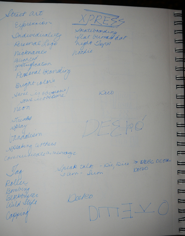
NAME GENERATION: 5 MINUTES
After all my research, I realized that the common theme throughout the long history of graffiti is communication. Sometimes it is just a person expressing their feelings, other times it is trying to give someone a specific message (like those ladies in the night). Since the history goes so far back, I turned to my rather rusty Latin to find the right name for the company.
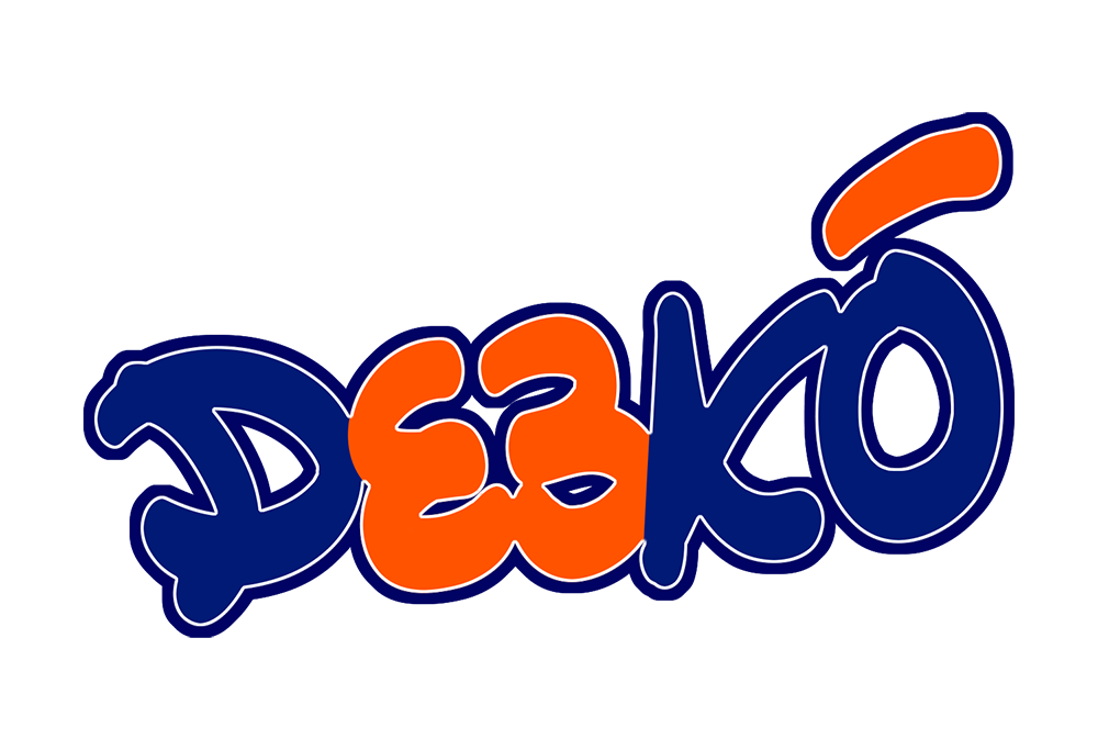
I decided to use the word dícó, which means "I speak", as the name of the company to represent the communicative nature of graffiti. It is pronounced "dee-co" but could easily be confused for a short "i", so I changed the final spelling to "Deekó".
After all my research, I realized that the common theme throughout the long history of graffiti is communication. Sometimes it is just a person expressing their feelings, other times it is trying to give someone a specific message (like those ladies in the night). Since the history goes so far back, I turned to my rather rusty Latin to find the right name for the company.
I decided to use the word dícó, which means "I speak", as the name of the company to represent the communicative nature of graffiti. It is pronounced "dee-co" but could easily be confused for a short "i", so I changed the final spelling to "Deekó".
It was great to be able to pull in my outside knowledge of Latin to create a name that is interesting and I think really represents the true meaning of graffiti: communication with others. It's about the personal message that people are trying to get out there, and therefore "I Speak" is a great representation of that.
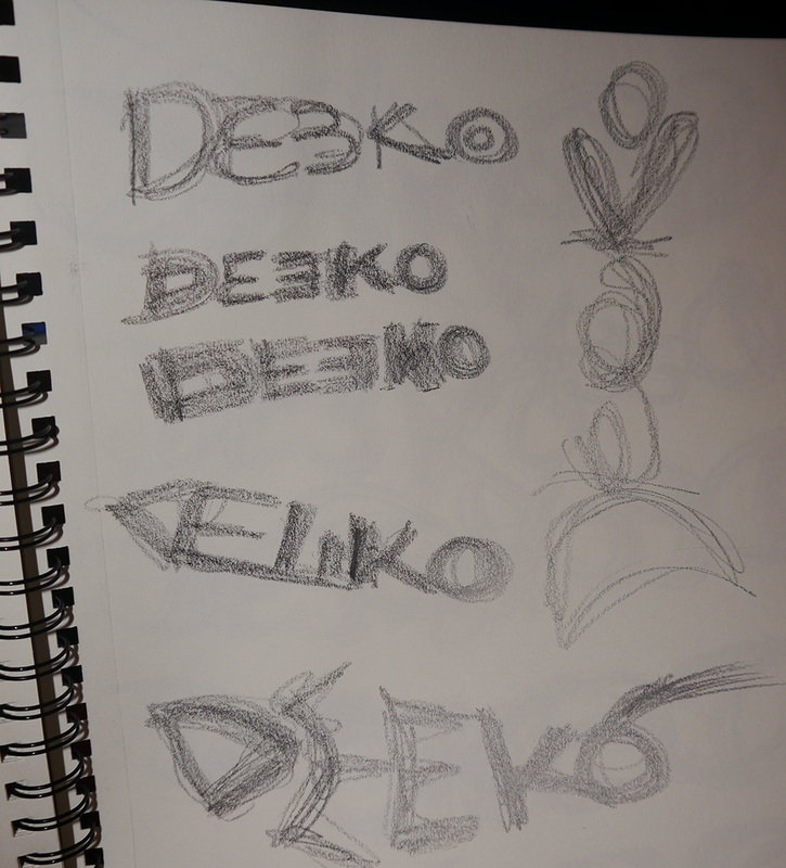
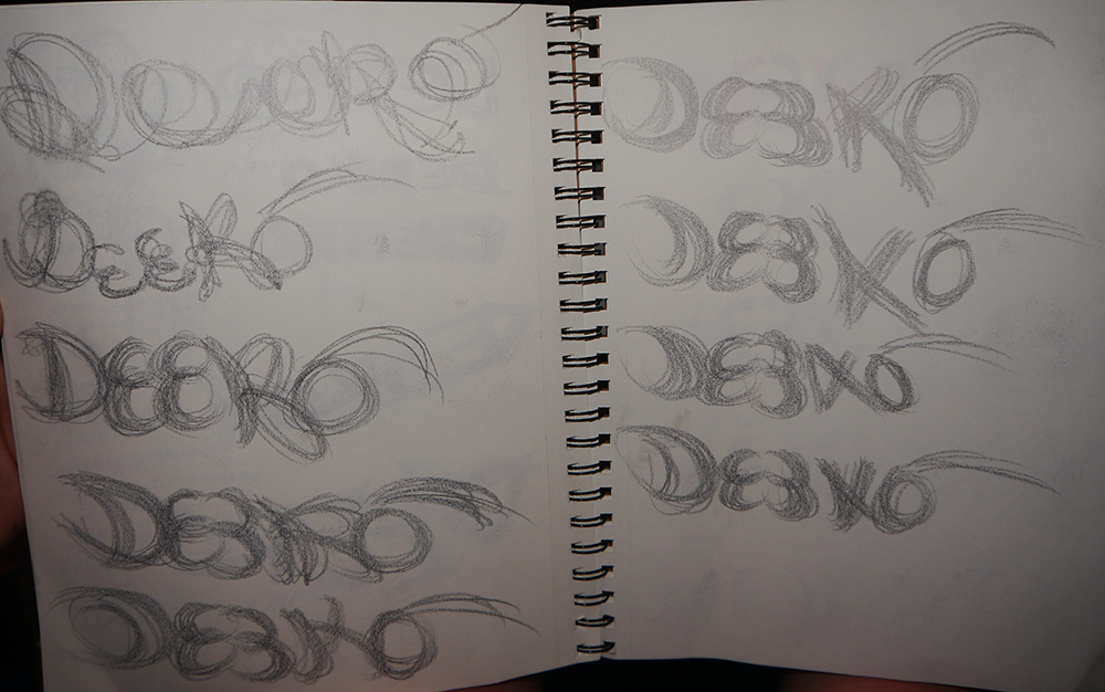
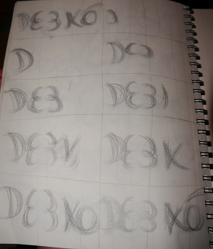
SKETCHING: 30 MINUTES
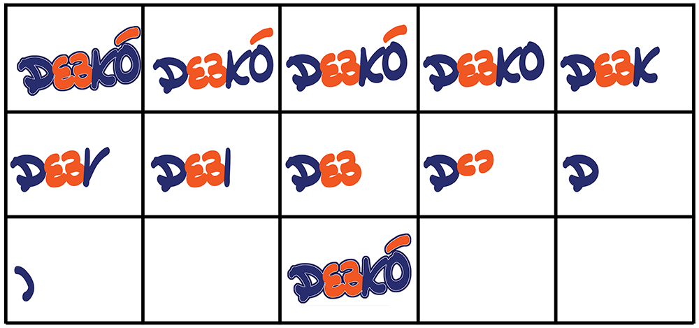
I am definitely no graffiti artist, so I set out to just do my best with the design of the logo, even if I couldn't make it look as interesting as many of the art out there. I started with my thin pen and notebook, but quickly realized that a finepoint pen just doesn't do the job of giving a graffiti illustration, and moved on to a thick pencil instead.
I am definitely no graffiti artist, so I set out to just do my best with the design of the logo, even if I couldn't make it look as interesting as many of the art out there. I started with my thin pen and notebook, but quickly realized that a finepoint pen just doesn't do the job of giving a graffiti illustration, and moved on to a thick pencil instead.
| 
| 
| 
|
I continued to sketch the name over and over again until I eventually created something that I was interested in fully designing out. I also sketched out the storyboard for the motion graphic video of creating the logo, though I took a different approach. My design starts with the finished logo and works backwards taking one step of the logo off one by one, ending with a white screen, and begins again.
DESIGN: 70 MINUTES
I spent a majority of the time just translating my ideas to a finished design in Adobe Illustrator and Photoshop.
I spent a majority of the time just translating my ideas to a finished design in Adobe Illustrator and Photoshop.
What I found most difficult was translating what was in my head during the sketching period to a polished product that I was really happy with in Illustrator. While I enjoy doing visual design, interaction design is more my speciality, and I had a difficult time placing my finger on just what wasn't perfect with my design.
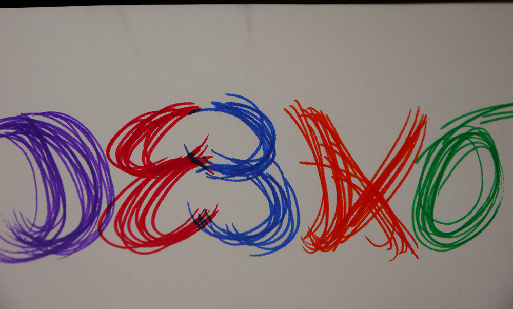
When I finished in Illustrator, I just had simple letters in some interesting colors for the logo. I decided to place the "E"s facing each other to really reinforce the communication theme. I imagined those "E"'s as two people facing and talking to each other.

I next took it into Photoshop and added two strokes to the image: one thin white, and one thicker dark blue. This was finally when the design looked complete to me. It started to look like a design instead of just hand drawn letters.
I also completed the storyboard in Adobe Indesign:
OVERALL
Overall I really enjoyed this challenge. It made me feel more connected to learn the history and it really helped me create a more thoughtful design.
Overall I really enjoyed this challenge. It made me feel more connected to learn the history and it really helped me create a more thoughtful design.
If I had it to do over again (and some more time), I'd add more colors to the design. During my research, I saw such beautiful colorful pictures and I would have liked to replicate that in my design. I think my struggle with the design tools and making it pixel perfect tripped me up more than anything and made it difficult for me to create something wild and fanciful, instead of a kind of one note design.

 RSS Feed